

 (647) 478-5858
 (728) 500-4818
Beauty Institute · Branding + Online Brand Review
One Brand, Premium From Every Angle
A consistent brand that justifies premium pricing
A beauty and aesthetics training institute charged premium tuition but looked scattered online, with mismatched colors, logos, and messaging across every channel. We built one cohesive brand and rolled it out everywhere, and enrollment inquiries from higher-intent prospects grew 60%.
Results at a glance:
- Enrollment inquiries up 60%
- Brand consistent across channels
- Perceived value improved
- Done in 4 to 6 weeks
The Challenge
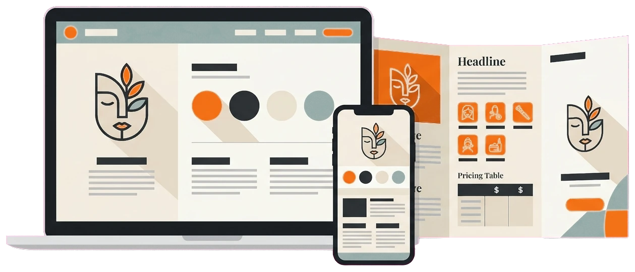
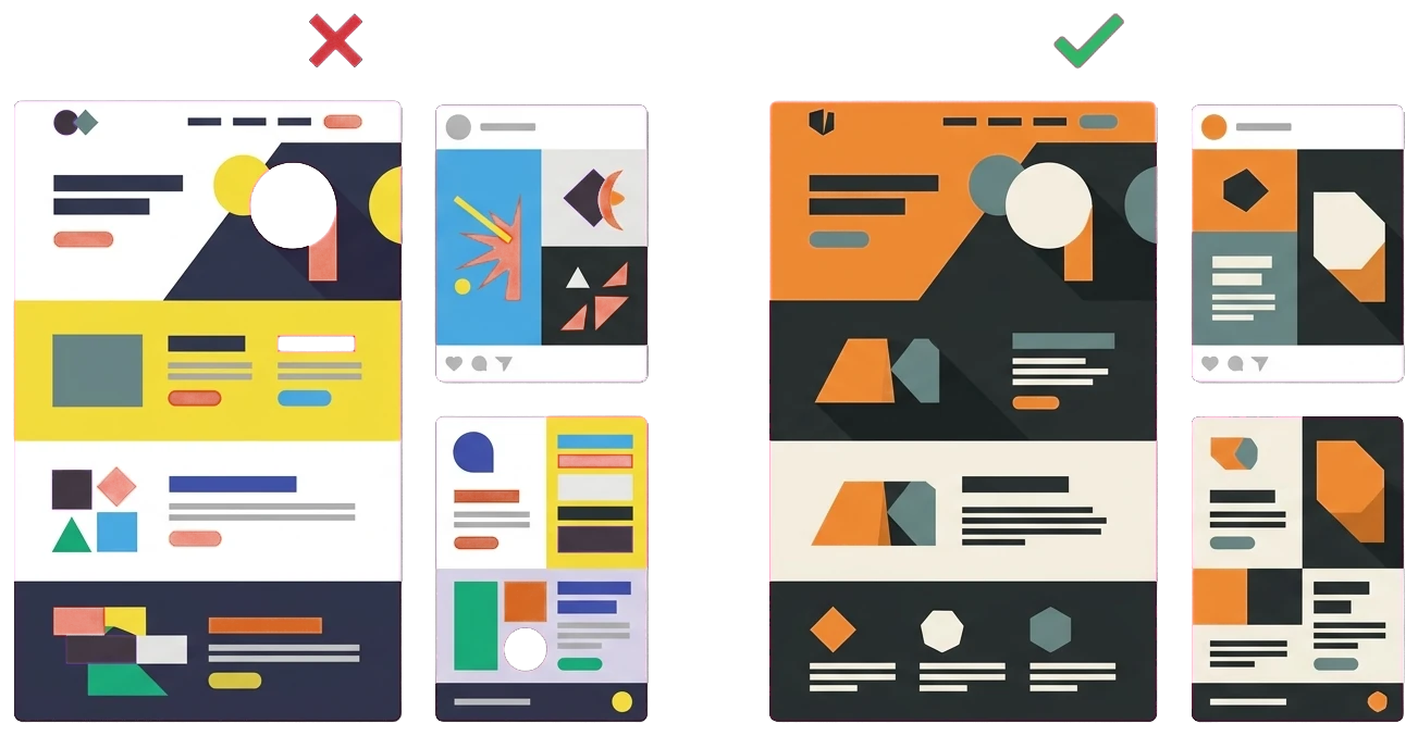
The institute charged premium tuition, but nothing online backed that up. The website said one thing, the social feeds said another, and the printed materials looked like they came from a different company entirely. Prospective students never got the sense of prestige the tuition implied.
The root of it was simple: there was no brand system holding anything together. Each channel had drifted on its own:
- Colors did not match from the website to social to print
- The logo appeared in different versions across channels
- Messaging and tone shifted depending on where you looked
- Each channel had drifted with no shared standard
- The fragmented look made the institute feel less established
- Nothing signalled the premium positioning the tuition implied
The Solution
We reviewed the online brand end to end, then built one cohesive identity and rolled it across every touchpoint so it all felt like a single premium brand. Here is what went into it.
- A full online brand review across every channel
- A cohesive identity: logo, palette, type, voice
- Consistent rollout across web, social, and print
- Clear logo usage rules to stop future drift
- A refreshed website that leads with the premium look
- Branded social templates for consistent posting
- Enrollment materials matched to the new identity
- Brand guidelines handed off to the team
Build one identity, not four different looks
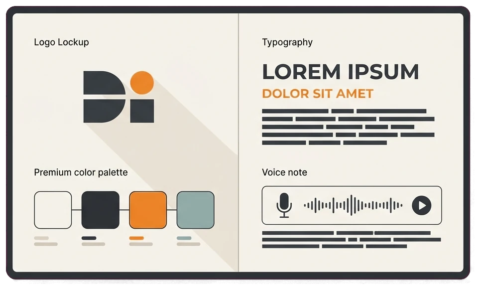
A premium brand cannot look like four different companies depending on where you find it. We built a single identity system so every touchpoint would speak with the same voice and carry the same premium feel.
- Logo usage: one clear logo with rules for how and where it appears, so it stops showing up in three different versions across channels.
- Color palette: a defined premium palette used consistently everywhere, which is what makes a brand instantly recognizable at a glance.
- Typography: a set typeface system so the website, social, and print all read as the same brand rather than three separate ones.
- Voice: a consistent tone that matches the premium positioning, so the words feel as established as the tuition price suggests.
Roll the brand out everywhere it shows up
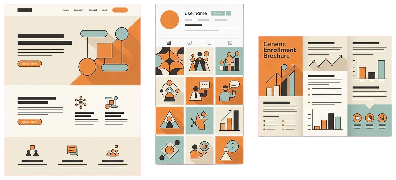
An identity system only works if it actually reaches every touchpoint. We rolled the new brand across the website, social, and enrollment materials, then refreshed the website so it led with the premium look.
- Website refresh: we updated the site to lead with the new identity, since it is the first place a serious prospect checks before enrolling.
- Social templates: branded post templates kept the feeds consistent and on-brand without extra work for the team every time they posted.
- Enrollment materials: the brochures and enrollment assets were rebuilt to match, so the whole journey felt like one premium brand from first click to sign-up.
- Guidelines handoff: we handed over brand guidelines so the team could keep every future asset consistent and stop the drift from creeping back in.
How We Did It
01. Brand audit
A full online brand review across the website, social, and materials to map every inconsistency.
02. Identity system
Built a cohesive identity covering logo usage, color palette, typography, and voice.
03. Asset creation
Created branded website, social, and enrollment assets from the new identity system.
04. Channel rollout
Rolled the brand across the website, social channels, and enrollment materials so every touchpoint matched.
05. Guidelines handoff
Handed off brand guidelines so the team could keep everything consistent going forward.
The Results
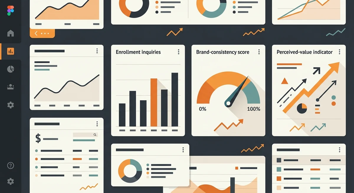
The rollout gave prospects a more consistent experience across the website, social channels, ads, and enrollment material. Enrollment inquiries rose 60% during the measured period, while program demand, campaigns, seasonality, and admissions follow-up remained contributing factors.
| Enrollment inquiries | +60% |
| Brand consistency | Across all channels |
| Perceived value | Improved |
| Build time | 4 to 6 Weeks |
Services & tools used: Brand review, brand guidelines, website refresh, and social templates.
brandingConsistency became an operating system, not a one-time redesign
The identity gained value because admissions, social, advertising, print, and web teams could apply the same rules after launch.
- Give teams reusable templates and clear ownership.
- Protect readability and accessibility while maintaining the premium look.
- Measure inquiry quality and enrollment outcomes, not visual approval alone.

Frequently Asked Questions
How we assessed brand consistency and inquiry quality
Channels and lead signals reviewed
The assessment compared the website, social profiles, advertising, print assets, and visual guidelines before and after the identity rollout. Inquiry volume and the institute's description of prospect quality were then reviewed alongside the consistency of the new brand presentation.
Where brand measurement stays qualitative
The 60% inquiry increase is measurable, while perceived value and brand consistency also require human judgement. Tuition, program demand, admissions follow-up, seasonality, reputation, and campaign activity can influence enrollment inquiries, so the identity work should not receive sole attribution.
Editorial review: Gilmedia strategy team. First published August 17, 2026.
Related Gilmedia services
Look scattered when you’re actually premium?
We will review how your brand shows up across every channel and show you how to unify it. Look as established as you really are.
Get your free brand reviewNo obligation. A 15-minute call and a clear action plan.
Services in this project: Branding · Website Design