

 (647) 478-5858
 (728) 500-4818
Real Estate · Landing Page CRO
Turning Ad Clicks Into Home Valuation Leads
A page that speaks to sellers instead of about the agent
A residential real estate agent ran Google and Meta ads to attract sellers but sent all the traffic to a generic homepage that talked about the agent instead of the visitor. We built a focused valuation page, and the same ad budget started producing a steady pipeline of seller leads.
Results at a glance:
- Landing page conversion up from 1.6% to 7.9%
- Valuation requests up 210%
- Cost per seller lead down 61%
- Form abandonment down 34%

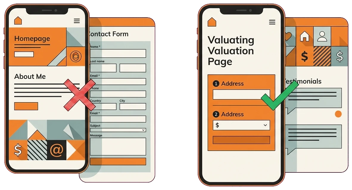
The Challenge
The agent was paying for clicks from people thinking about selling, but almost none turned into a valuation request. Visitors landed, read an About Me section, and left without ever giving their address or contact details. The ads were doing their job, so the leak was clearly on the page.
A quick review of the destination page showed why the clicks went nowhere:
- No dedicated landing page for the seller campaigns
- The homepage buried the offer with no clear single action
- No social proof placed anywhere near the form
- A long contact form that asked for too much too soon
- On mobile the call to action sat below several scrolls
The Solution
We built a focused home-valuation landing page with one clear promise: find out what your home is worth. We led with a short two-step form and stacked the page with proof, the core of any good conversion program. Here is what went into it.
- One clear promise: find out what your home is worth
- A two-step, address-first form
- Neighborhood-specific headlines that match the ads
- A single clear action with nothing to distract
- Recently-sold proof and testimonials by the form
- Agent credentials to build seller confidence
- A mobile layout with the form in reach
- Message match tuned against the Google and Meta ads
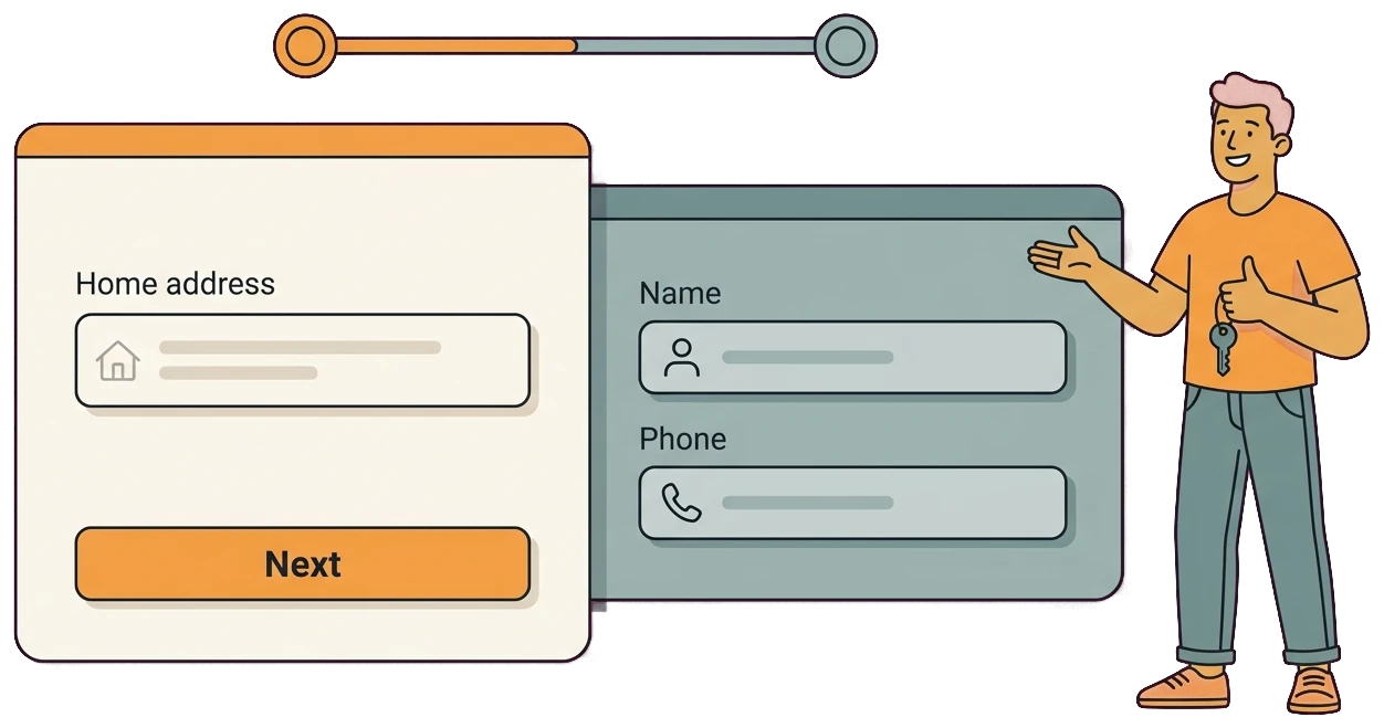
Ask for the address first, the phone number last
A long form at the top of a cold visit scares people off. We flipped the order: ask for the one thing a seller happily gives, their address, then ask for contact details once they are already engaged.
- Address first: the page opens by asking only for the home address, which feels low-risk and matches exactly why the visitor clicked.
- Contact details last: name and phone come on the second step, after the seller is invested, so far fewer people bail out.
- A short, two-step flow: breaking the ask into two small steps feels easier than one long form and keeps momentum going.
- Less abandonment: reordering the questions dropped form abandonment by 34% and lifted conversion from 1.6% to 7.9%.
Put the proof right where the decision happens
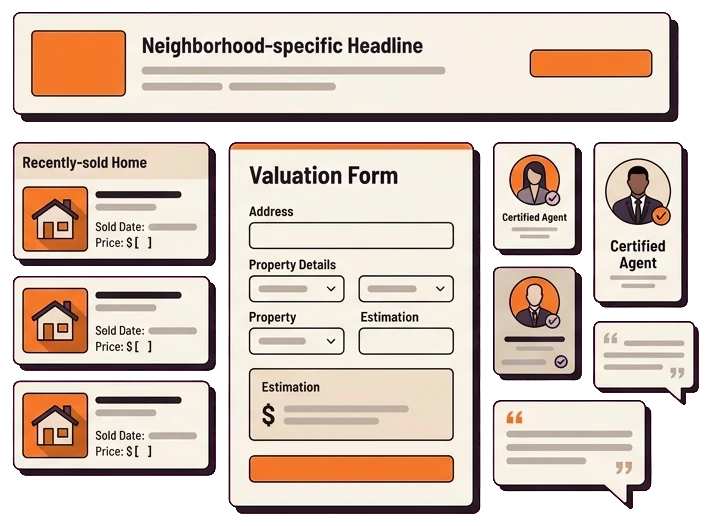
Sellers hand over their address only when they trust the agent. We placed the proof right next to the form, so reassurance is there at the exact moment of decision, a small change with a big effect on page performance.
- Recently-sold proof: cards showing homes the agent recently sold prove real results better than any claim in an About Me section.
- Testimonials beside the form: short seller testimonials sit right next to the form, so the reassurance lands at the moment someone decides to submit.
- Agent credentials: clear credentials build confidence that this is the right person to value and sell a home.
- Neighborhood-specific headlines: headlines matched to the seller’s area make the page feel local and relevant, not generic.
- Message match with the ads: the page mirrors the ad that brought them, so the promise stays consistent from click to conversion.
How We Did It
01. Message-match review
We reviewed the seller ads against the destination to find where the promise broke down.
02. Wireframe and copy
We wireframed a focused valuation page and wrote copy around one promise: find out what your home is worth.
03. Build the two-step form
We built an address-first two-step form so the easy question comes before the contact details.
04. Place trust and proof
We added recently-sold proof, testimonials, and agent credentials right next to the form.
05. Test and launch
We ran heatmap analysis with Microsoft Clarity and A/B tested the headline and form length before launch.
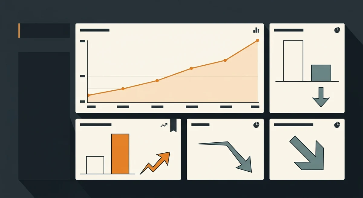
The Results
Valuation requests from the same ad budget jumped once the page asked for the address first and the phone number last. The agent went from a trickle of form fills to a steady pipeline of seller leads without spending an extra dollar on ads.
| Landing page conversion | 1.6% to 7.9% |
| Valuation requests | +210% |
| Cost per seller lead | -61% |
| Form abandonment | -34% |
| Build time | 2 to 3 Weeks |
Services & tools used: Landing page build, Microsoft Clarity heatmaps, GA4, Google Tag Manager, A/B testing, and CallRail.
landing page cro“Same ads, same budget, and now my phone actually rings with sellers. The page finally speaks to them instead of about me.“
Owner, Residential real estate agency

Frequently Asked Questions
Paying for clicks but not seller leads?
We will show you exactly where your landing page loses sellers and how to fix it. Turn the ad clicks you already pay for into valuation requests.
Get your free auditNo obligation. A 15-minute call and a clear action plan.
Services in this project: Conversion Rate Optimization · Website Design