Your website isn’t just a digital placeholder. It’s your chance to impress, connect, and convert! Whether someone lands on your homepage out of curiosity or intent, the goal is the same: keep them interested and guide them to take action. To make your website a customer magnet, here are 10 creative, fun, practical (and easy) website design tips you can start using right now!
1. Simplify Your Navigation
Your website isn’t a scavenger hunt! Visitors should find what they need quickly and easily. Think simple, logical menus with:
- Obvious labels like “About,” “Shop,” and “Contact.”
- Dropdowns for more specific categories.
- A max of 6–7 menu items to avoid decision overload.
Why It Works: Overcomplicated menus confuse and frustrate users. Clean navigation keeps them on track and engaged. For example, if you own a bakery, instead of listing every type of pastry, group them into broader categories like “Cakes,” “Cookies,” and “Specialty Items.” Easy peasy. When users can effortlessly navigate your site, they’re more likely to stay longer and explore what you have to offer. Clear navigation is also among good website design tips that build trust. This shows your visitors that you understand their needs and respect their time.
2. Optimize for Mobile Devices
Everyone’s on their phone. If your website doesn’t look great or work smoothly on a mobile screen, you’re losing potential customers. Focus on:
- Responsive design that adjusts to any screen size.
- Big, tappable buttons.
- Fast-loading visuals.
Pro Tip: Test your site’s mobile version yourself. If you’re pinching, zooming, or cursing under your breath, it’s time for a redesign. Fun fact: Over half of web traffic comes from mobile users, so this step isn’t optional. A mobile-optimized site ensures your visitors can browse and shop with ease, no matter where they are. By providing a seamless mobile experience, you’re showing customers that your business is up-to-date and easy to engage with on the go. This applies to website design in Miami, Toronto, and all the way to Brooklyn, New York.

3. Highlight Your Call-to-Action (CTA)
A killer CTA is like a friendly nudge saying, “Hey, click here!” Make it pop by:
- Use bold, contrasting colours (think bright yellow on black or red on white).
- Writing action-packed phrases like “Shop the Sale” or “Claim Your Free Trial.”
- Placing it in obvious spots like at the top of your page or after key sections.
Example: Imagine a vibrant “Book Now” button right below a dreamy photo on a travel site. It’s hard to resist, right? Even we want to go to this imaginary, hypothetical beach house in Bali. Your CTA should have that same irresistible vibe. Basically, your CTA needs to be Bali-level.
A well-placed CTA removes confusion and directs visitors to take action, whether that’s making a purchase or signing up for a service. CTAs that are visually appealing and clearly worded create a natural flow for your customers, making it easy for them to say “yes.”
4. Use Whitespace Wisely
Whitespace isn’t wasted space, it’s your secret weapon for creating a clean, modern look. Strategic use of whitespace can:
- Make your design feel more open and less cluttered.
- Draw attention to key elements like CTAs or headlines.
- Improve overall readability and focus.
Why It’s Important: Think of whitespace as giving your design room to breathe. A crowded page overwhelms visitors, but a balanced layout with plenty of spacing feels professional and inviting. If you’re showcasing products, let those images shine with generous padding around them. Whitespace doesn’t mean “empty,” it’s about creating balance and guiding the eye naturally to the most important parts of your site. A well-placed design with ample whitespace means confidence and clarity.
5. Use Visual Hierarchy to Guide Users
Don’t let visitors get lost in a wall of text. Use visual cues to guide their attention by:
- Making headlines larger and bolder than body text.
- Adding whitespace to prevent clutter.
- Using colour pops for important sections (like CTAs).
Think About It: If you’re a fitness coach, your landing page might start with a high-energy photo, a bold “Transform Your Body Today!” headline, and a bright green “Get Started” button. It’s simple, impactful, and directs attention. A clear visual hierarchy leads users to the most important parts of your site without overwhelming them. By structuring your site to highlight what matters most, you’re creating a seamless and intuitive experience for your visitors.
6. Add Authentic Branding
This is your brand’s personality online, so make it count. But also, make it consistent. Choose one thing and do it well, and forever. Showcase your vibe by:
- Sticking to your brand colours, fonts, and voice.
- Adding custom imagery. (Be gone, cheesy stock photos.)
- Including little touches that show your personality, like branded icons or fun animations.
For Example: A quirky coffee shop might use earthy tones, handwritten fonts, and photos of their baristas at work. Authenticity builds trust – and trust turns visitors into customers. When your branding shines through, it helps visitors connect emotionally with your business. Consistent branding also makes your site more memorable, keeping your business top-of-mind long after visitors leave.
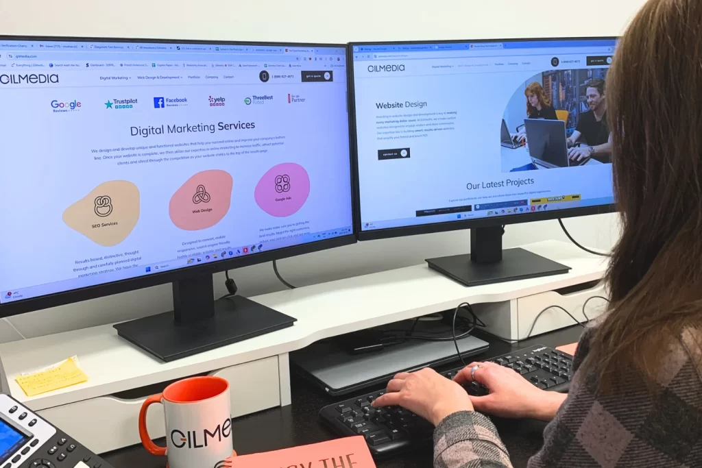
Take Gilmedia, for example! We are proudly repping that #orangelife. You know our brand immediately when you see it, and that’s what matters.

7. Prioritize Readability
Nobody wants to squint at tiny text or slog through endless paragraphs. Keep your content easy to read by:
- Choosing legible fonts. (The sans-serif fonts like Arial or Roboto work great.)
- Keeping your paragraphs short and snappy.
- Using bullet points – like these! – to break up information.
Why It Matters: A technology company blog, for example, might take dense material and chunk it into smaller sections peppered with subheads and images. Remember: Less is more. When content is easy to read, users are more likely to stay engaged longer. Readability isn’t just about text, though. It’s about crafting an experience that feels frictionless to the user, keeping them coming back for more.
8. Build Trust with Social Proof
People love to see proof that others love what you do. Show off your wins with:
- Customer testimonials (bonus points if you include photos or videos).
- Case studies with real results.
- Logos of well-known brands you’ve worked with.
Example: If you’re a freelance designer, highlight a glowing review from a happy client alongside snapshots of the projects that you’ve created for them. Let your work do the talking, and when possible, let satisfied customers also do the talking. Showing social proof reassures guests that they are making the correct choice by choosing your business. The more you show real success stories, the more you encourage people to trust and have confidence in your brand.

9. Design with Accessibility in Mind
Accessibility isn’t a moral imperative, it’s good business. Make sure everyone can use your site by:
- Adding alt text to images for screen readers.
- Using high-contrast colors for better visibility.
- Ensuring it works well with keyboard navigation.
Pro Tip: Tools like WebAIM’s Contrast Checker can help you spot issues. Inclusive design means more people can engage with your site, and that means more customers for you. Making your site accessible shows that you care about all users, which builds brand loyalty. Accessible websites also have the added benefit of performing better in search engines, helping you reach an even broader audience.
10. Add Interactive Elements
Make your website unforgettable, rather than basic, by adding in some interactive elements, such as:
- Hover effects on buttons or images.
- Interactive product carousels or sliders.
- Engaging videos or animations.
Why It Works: Movement and interactivity draw in attention and make your site feel modern and dynamic.
For example, a fashion site might let users swipe through outfits or zoom in on product details. These little flourishes can make your site way more engaging and get users clicking. Interactive features aren’t just fun but functional, pushing users to explore and spend more time on your site.
Now You Try!

Written by