If you are running ads on Google or you have a robust SEO plan that involves targeting specific keywords, then you probably design landing pages as part of these efforts.
Google Ads won’t work if users click your ad and land on a page that doesn’t match their search or intent – they’ll leave fast. That’s why nailing the layout, functionality, and content of your landing page is crucial to keep them engaged and avoid high bounce rates.
To come out of this situation as a winner, you need to design a great landing page that converts – crafting a visually appealing, user-friendly space designed to engage visitors and drive them to take action. It might sound simple, but let’s dive in and explore how to make it happen.
What is a service page and how is it different from the homepage?
When delving into digital marketing, you’ll hear the term “service landing page” a lot. These are the inner pages on your website that represent each particular service or product your company sells. For example, if you’re an appliance repair company, you’ll have separate landing pages for each appliance you fix (stove repair, dishwasher repair, washer repair and so on); if you’re a window installer, you’ll have landing pages for every window you can install.
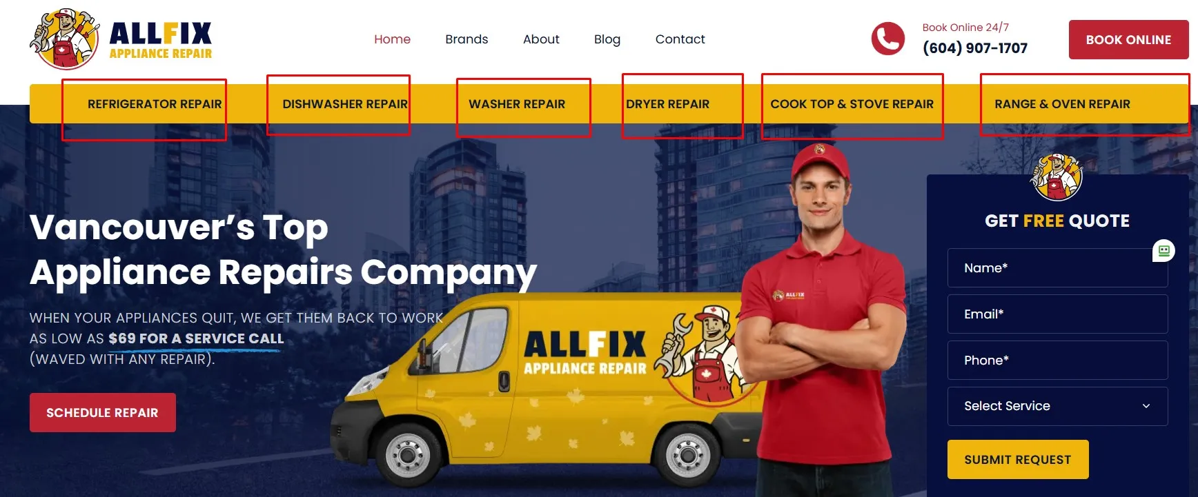
The purpose of a landing page is different from the homepage because each of them targets one particular service. This is not only important for the type of traffic you get, but also for SEO. Here are the 4 key characteristics of landing pages that will help you get a better understanding of their purpose and how they differ from the homepage:
- A services landing page has only one purpose: to convert.
Unlike a homepage, it’s focused entirely on one service, with CTAs guiding the user to take action (signing up for your newsletter, filling out a form, or giving you a call.) - A services landing page has to be tailored to your target audience
It’s designed specifically for the people who land on it after searching for something specific. Whether they clicked on an ad or found you organically, your page should push them toward conversion.
It is worth mentioning that not all traffic you get on your services pages is the same. For example, if someone clicks on your ad, you can safely assume that they are further down the conversion funnel than someone who reached your website organically and might just be browsing your website. Therefore, there’s a little more freedom to how you will design your organic service page than how you would normally design a super targeted PPC (Pay Per Click) landing page. However, one thing to remember is that you can definitely push sales more on your services pages than on your homepage. - A services landing page should be specific to the offer or product.
Similar to what we’ve mentioned before, a service landing page should only have content specific to the product, offer or service that you want to promote. For example, if your company offers a remote starter installation service, everything on your page should be about this service. The person who lands on this page doesn’t care that you also do dash cam installations for vehicles, so don’t distract them with irrelevant information. - A services landing page should have strategically placed CTAs.
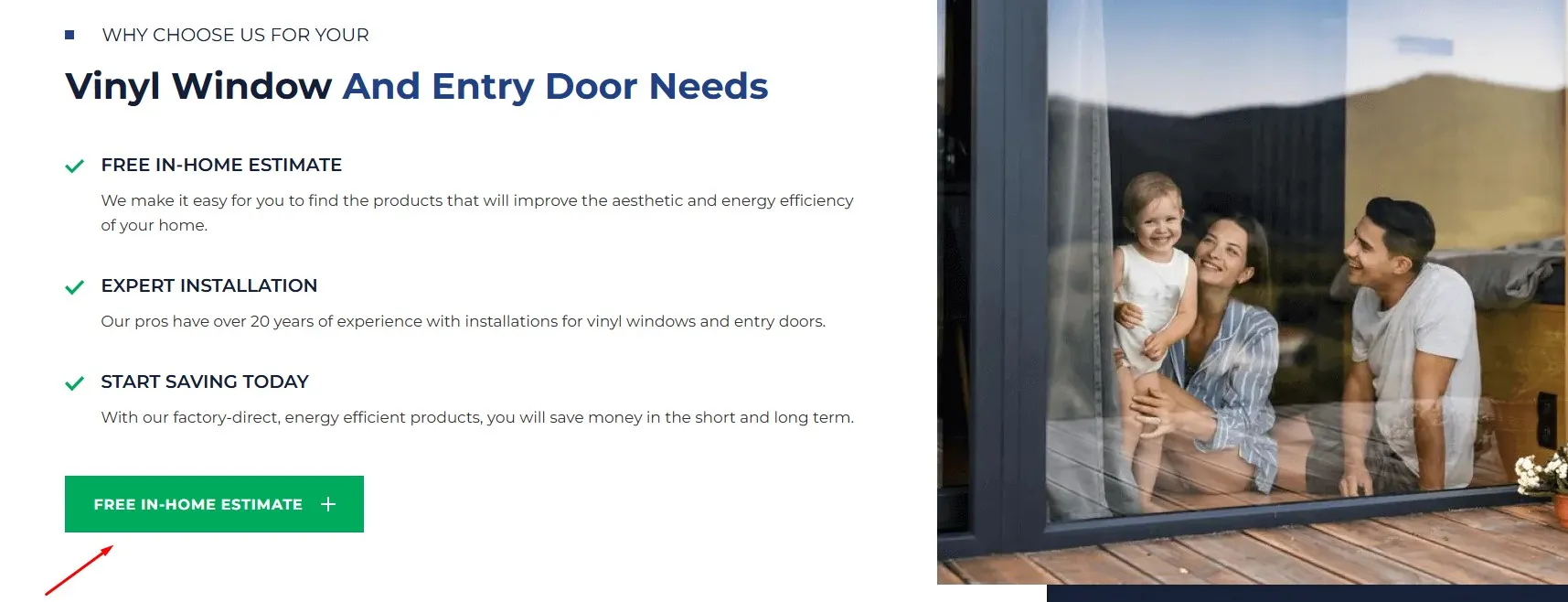
An irreplaceable part of a landing page is, of course, the Call-to-Action (CTA). A CTA can be anything from calling a phone number to filling out a form, but whatever it is, it should be straightforward and obvious. For example, “Call Us Now! Get Started Today! Call Today for 10% Off” are all great examples of CTAs.
Now the obvious question is: how do you go about designing a good and effective landing page for the average user?
Luckily, there are some tried and true things you can do to build a landing page that converts visitors to your website into customers; and we’re going to get into these things in this blog article.
How to design your service landing page
Here are the main guidelines that will help you redesign your service landing page to make them more user friendly and enjoyable to interact with:
-
Keep it simple
While your website’s appearance is quite important, most visitors won’t come to your site to evaluate the design. Instead, they come to your website to find some information or to complete some action. Too many unnecessary visual elements will just confuse the visitor, which is why simplicity is your best friend:
Don’t use too many colors (about 3 colors are ideal).
You should use no more than 3 typefaces in no more than 3 different sizes.
Don’t overdo it with graphics – Only use graphics when you need them to perform a specific function like help a user perform a task. -
Navigation
Intuitive navigation is crucial and it means that a visitor is able to land on your site and not have to think about where they should click next.
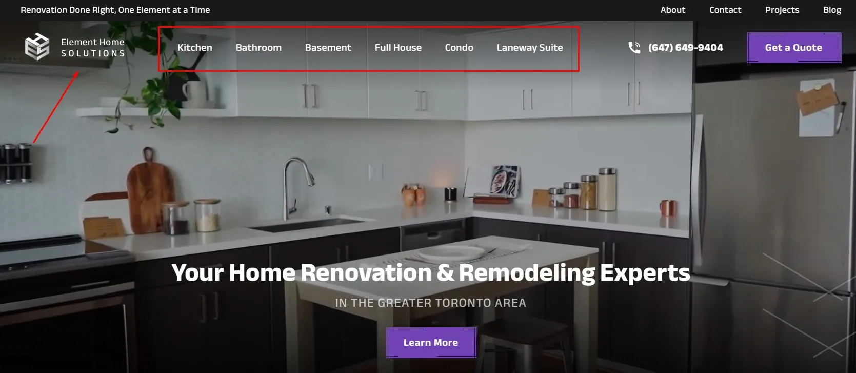
✓ Your primary navigation menu should be simple and at the top of the page.
✓ Use breadcrumbs on all pages to help users with their navigation trail.
✓ Include a search box where visitors can type in their keywords. -
Arrange the elements into a hierarchy
Lead visitors to a desired action in an enjoyable and natural flow. By adjusting the size, color and position of certain elements, you can ensure that those elements capture the users’ attention first.
-
Keep it consistent
The overall look of your website’s services pages should be consistent with the rest of the website. Colour schemes, backgrounds, typefaces and even your writing tone should be similar. That’s not to say that each page should have the exact same layout, but by keeping a general consistency in terms of specific blocks of information, you’ll make it easier for visitors to get a sense of what information they’re likely to find throughout the landing pages.==
-
Accessibility and responsiveness
We’ve mentioned the importance of accessibility and responsiveness earlier in the text, but it’s worth emphasizing once again that in order to provide great user experience, your website should be compatible with different devices, operating systems and browsers available out there. In terms of responsive design, that means that the content is automatically reshuffled to adjust to the screen size of whatever device was used to access the website. One key takeaway is that not everything you have on your desktop version should be featured on the mobile version. Instead of trying to squeeze in different elements just so you can keep an identical look across all platforms, think about adhering to platform-specific conventions and adjusting your landing pages to look good on a smaller screen.=
-
Keep it familiar
Innovation is great, and bringing something new into your website’s design is always welcome, but there are certain web conventions that users today are accustomed to, and for the sake of simplicity and increasing conversions, some web design elements that shouldn’t be changed. Some of them are:
✓ Keeping the logo at the top left or top center of the page
✓ Placing the main navigation bar at the top of the page
✓ The logo should be clickable to take the visitor back to the homepage
✓ Links should change colour when you hover over them, and so on…
Why you should redesign your services page
Let’s talk about the main reasons why you should consider redesigning them:
- It’s not giving you results – The first and most important reason why you should redesign your services page is because it’s not giving you the results you need. If you’re getting the traffic, but not the conversions, it’s time to redesign.
- If your marketing strategy has changed – Digital marketing is fluid, which means your strategy will change as new data and trends arise. You obviously don’t need a full website redesign every time you make a change in your marketing strategy, but if your goals have changed from signups to sales, then you’ll have to look into redesigning your landing pages.
- It’s not user friendly – If you have a “dysfunctional” website that makes it difficult for the visitor to find the basic information or it is difficult to navigate, then it is time for a website redesign. The functionality of your site should be a major focus on your services landing pages.
- Your website isn’t responsive – Nearly half of website traffic today comes from mobile devices. If your services landing page doesn’t look good on mobile devices, you’re missing out on 50% of potential customers right there!
- You want to refresh the content – Great content can improve everything from SEO to customer retention. If your content doesn’t offer clear and concise answers to your visitors’ questions and if it doesn’t flow naturally, it’s time to rethink your content strategy.
How to Redesign your Services Page
Now that we’ve addressed some of the reasons why you should redesign your services landing pages, it’s time to show you how to do it. In order to create a successful design of a service landing page, you need to think about 2 major categories: text and design. We will address each of these separately to give you a solid understanding of what a services page redesign entails:
How to write your service page text
It’s not just what you say, it’s how you say it. You’ll increase your chances at landing a conversion if you make your content concise and organized. Here are the key principles you should follow to improve your services landing page in terms of content:
- Describe your services page in the headline. If the title doesn’t immediately show the visitor how they can benefit from your service, they are less likely to convert. Around half of online shoppers will leave a website if they can’t understand what the company does, so providing them with essential information right from the beginning is the best way to grab their attention.
- Stick to the point when describing your services. If you’re a personal trainer and you have a slogan that says “Feel better in your skin! Try our company today!”, that will pretty much explain nothing to your reader. But, if you say “Toronto’s trusted personal trainers. Stay fit, stay healthy!” the visitor will immediately know what your services are, why they should choose you and where you are located.
- Don’t forget about the FAQs. Not only are FAQs useful for turning visitors into conversions by answering some of the common questions, but they are an amazing tool for getting better ranking on search engines. You’ll notice that when you type in a question on Google, it will give you a snippet such as the one below.These answers come from various websites’ FAQs, and if you don’t have them, you’re missing out. Remember, Google wants to rank websites that offer good answers to frequently asked questions, but how do you know what these questions are? Well, the conversations you’ve had so far with your clients can help you understand some of the most common concerns that your target audience may have, and you can also check out your competitors and see what they are writing about. If you’re in the same industry, you’ll pretty much have the same FAQs, so think of a way to answer these questions better and provide a simpler answer to your visitors.
- Be smart in your copywriting and use a formula. There are numerous ways to write website copy, but sticking to a hierarchical layout will ensure that your text has a natural flow:
✓ Headline – Grabs attention and conveys how you’ll solve the problem
✓ Opening – Tell your visitor how they will benefit by using your service
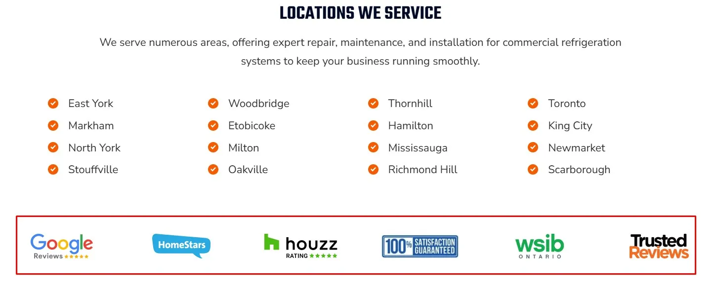
✓ Build trust – After you describe how you can help visitors, show them why they should trust you. Showcase your certifications and awards in this section.
✓ Elaborate – At this point, you should answer two questions: What exactly you do and how you can help your potential customers in greater detail.
✓ Summarize – Highlight the benefits of choosing your business by summarizing key advantages in bullets.
✓ Include testimonials or a portfolio of your work – Build credibility and trust by showcasing testimonials from previous clients. You can also show your clients your past work by incorporating videos or images.
✓ CTAs and urgency – CTAs should be strategically placed across the page (not too many, two or three times tops) and you should always have one at the end of the page. You can also include a countdown timer for a discount to invoke a sense of urgency.
See some examples of trust signals:
 Whether you need a landing page for your Google Ads or your SEO efforts, the tips above will help you stand out from your competition and convert users into customers.
If you need help with creating effective landing pages for your online marketing efforts, get in touch with the team at Gilmedia. We have plenty of experience with creating landing pages that convert for both SEO and Google Ads. You can contact us by calling our office at (647) 478-5858 or sending us a message through our contact page.


