Mobile is the way of the future. There is no denying it at this point. We probably don’t even need to convince you with links to research studies that show the share of organic search results between desktop and mobile – but we still will.
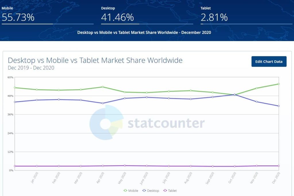
This helpful tool from statcounter shows the difference between mobile and desktop searches worldwide:

And if you look at just Google (which is a good benchmark to start with when you consider Google’s dominance), mobile searches began outperforming desktop searches in 2015. We’re now six years removed from this, and there are no signs that mobile is slowing down.
What does this mean for you? Well, it means that if your website is not optimized for mobile, then now is the time to make the necessary adjustments to your website. You may have a beautiful desktop version of your website, but if the mobile version isn’t as great, then you could end up dropping in search results for your website’s most relevant keywords and search terms.
In this article, we are going to dive deeper into what makes mobile so important for your SEO Toronto strategy and what you can do to make sure your website is mobile-friendly.
The Importance of Mobile SEO
We have already provided some stats and references that show why you need to put a high premium on mobile SEO. But there is one tidbit of information that punctuates the importance of mobile, and that is the implementation of Google’s Mobile-First Indexing.
This is something Google put into effect on July 1, 2019. To put it simply, Google started prioritizing the mobile version of websites for indexing and ranking. So when Google crawls websites to understand the content that is on the website and whether or not it is relevant to individual search queries, Google checks the mobile version of the site and NOT the desktop version.
We know what you are thinking, and yes, because of this change websites can drop in search results, even though the desktop version of the site is perfect.
That being said, this move really should not come as a surprise to anyone. Google saw the writing on the wall regarding the rise in organic mobile searches. That is why the company made this shift towards favouring mobile websites – and this is why mobile SEO is more important than ever.
How To Improve Your Mobile Website
How you can go about improving the mobile version of your website is probably your main concern right now. But before we jump into the changes you can make on your website, you need to make sure you have the basics covered.
By “the basics,” we are talking about a couple of user-friendly things that strongly impact both the desktop and mobile versions of your website. We are referring to content and navigation.
Before turning your focus to the mobile version of your website, you need to make sure that your website has useful and unique content that benefits the user; and you need to make sure that your website has clean, structured and clear menus that make it easy for the user to find what they need.
If your website has good content and is easy to navigate, then you have a good foundation to build on, regarding the mobile version of your site.
Once you have perfected the content and navigation of your website, you can start focusing on more mobile-centric improvements. We should note that when it comes to implementing the improvements discussed in this article, it is best to get help from a professional to design your website in Toronto.
Without further ado, here are the improvements we will talk about in this article:
-
- Responsive Design
- Stop Using Adobe Flash Player
- Proper Spacing Between Clickable Elements
- Have A Click-To-Call-Link
- Check Meta Info On Mobile Search Results
- Check Mobile Speed
- Don’t Block CSS Or Javascript
Responsive Design
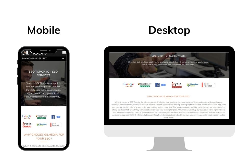
There are so many screens available to the average user, and they all have different sizes and dimensions. That means that it is incumbent on you to ensure that your website looks good not only on a desktop screen but also on tablet screens and all smartphone screens.

How do you create a responsive design you ask? You may not like this answer, but you create a responsive design with lines of code. The main aspects of your website that you need to target are the layout, media (images/video), and typography. By making sure your layout, images, videos, and font are flexible, your website will adapt to fit any screen in a way that makes it easy to explore and consume (ie. text is easy to read).
Here’s an example of code for a website that sets the layout for a website with the main area for content and a sidebar for two different screen resolutions:

Here’s a pro tip for checking whether or not your website is responsive no matter what screen it is being viewed on: You can open your website on your desktop and adjust the screen width of your browser. Watch the changes in the layout to see if any elements (text, images, layout) look out of place.
Stop Using Adobe Flash Player
Adobe has officially stopped supporting Adobe Flash Player as of December 31, 2020. Additionally, Adobe has been blocking content from running in its Flash Player since January 12, 2021.
When initially building your website, you may have used Flash to add alluring and visually-appealing effects. If Flash elements are still on your website, they need to be replaced immediately.
Flash helped make it possible to have intriguing features on the mobile or tablet version of your website – but this doesn’t mean you can no longer have these features on your website. That’s because these things can be applied to your site by using CSS 3, JavaScript or HTML 5.
Proper Spacing Between Clickable Elements
As you scale your website down to a smaller screen, you’ll notice that some elements on a web page get closer together. You’ll want to make sure that any clickable elements aren’t too close together.
This comes down to providing a good user experience. You don’t want users struggling to click on the button or a text link they want because the element they are targeting is too close to another clickable element. As you survey your website, you have to consider the ‘fat finger’. Fingers aren’t as precise as a mouse cursor, so your clickable elements need to be big and have ample space between other clickable elements.
The image below shows a good example of designing with the ‘fat finger’ we’re referring to. The clickable elements are big, which makes it easy for the user to click on the element they want without accidentally clicking on an element they are not interested in.

Have A Click-To-Call-Link
This one is pretty straightforward and fairly easy to implement. It means having a click-to-call link on your website so that the user can easily place a call to your company. Here is an example of a mobile website with a click-to-call link:

As you can see from the video, the click-to-call link is placed in a sticky menu. This ensures that the user always sees it as they peruse the website. Not only can they always see it, but they can always click on it. You can set a click-to-call link in a top menu item on your website with this code: <a href=”tel:5551112222″>(555) 111-222</a>.
5) Check Meta Info On Mobile Searches
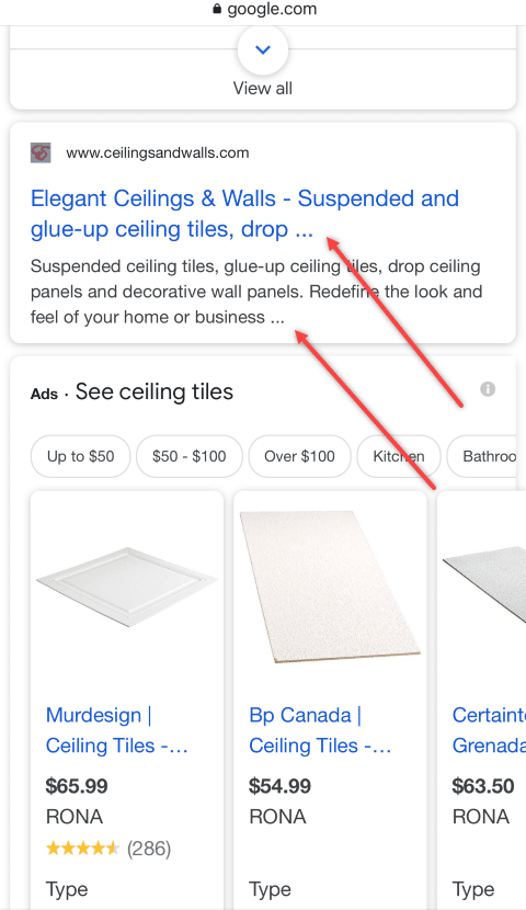
When it comes to small screens, there is only so much information that Google can display in its search results. Scaling down means there will be casualties, and in the case of Google search results, characters in the meta titles and descriptions are sacrificed. Here’s an example of that:

The best practice is to keep your meta titles and descriptions short and sweet. This is especially true for mobile search results. We would suggest doing an audit of all of the meta titles and descriptions on your website. See how they display in a mobile search result, and if you notice that the titles and descriptions on certain pages have important information being cut off, then you can work on improving the meta information for those pages.
6) Check Mobile Speed
e have some good news and some bad news for you. The bad news is that Google has found that 53% of mobile users will leave a website if it takes more than three seconds to load. The good news is that it is easy to check the speed of your website and diagnose any issues.
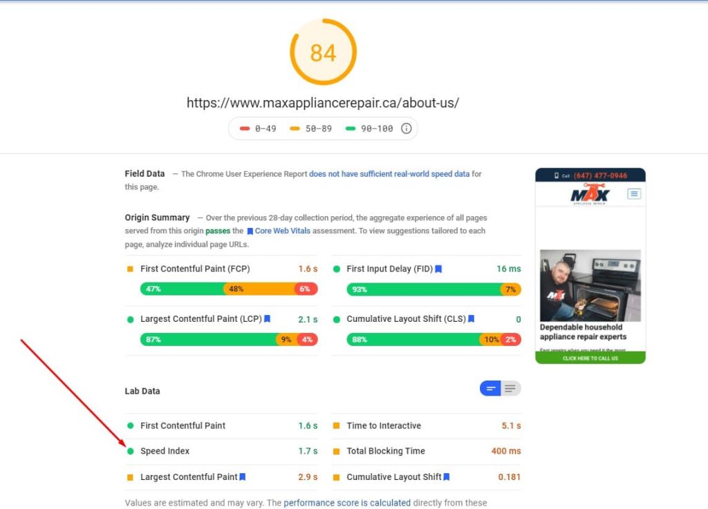
You can use Google’s PageSpeed Insights tool to check the mobile speed of your website page-by-page (Bonus: You can also use this tool to check the speed of the desktop version of your website).
It is a very simple tool to use. All you do is input your URL and wait as the system crawls and tests the page. It will eventually generate a report and attach a score to the page, which is generated based on some factors. One thing you will want to take away from the report is the speed index, which measures how quickly the content on the page appears.

7) Make Sure You Are Not Blocking CSS Or JavaScript
The process of optimizing a mobile website for SEO has come a long way and has thus gone through a few evolutions over the years. For example, did you know that some older mobile devices did not support CSS or Javascript? Because of this, web designers would block these to encourage faster load times.
Nowadays, you don’t have to worry about blocking CSS or JavaScript. You want Google to crawl the code on a page. This is important because it allows Google’s web crawlers to render your page in the way it is meant to be displayed to the average user. This makes it easier for Google to determine whether or not your site is mobile-friendly. If Google can’t see if your site is mobile-friendly, then your site can drop in search rankings.
Conclusion
If you are looking to improve your website as part of your SEO Toronto efforts, then taking care of the seven things we talked about in this article will get you closer to your goal. Since Google is prioritizing mobile versions of websites in a way that impacts search results, the time to make the mobile version of your website SEO-friendly is now.
Lucky for you, the SEO team at Gilmedia has been helping companies with their mobile SEO efforts for many years now. Our team has the knowledge and skills you can count on when you need a strong mobile version of your website. Give us a call today at (647) 478-5858 or send us a message through our contact page. We look forward to talking with you.


