 (647) 478-5858
 (728) 500-4818
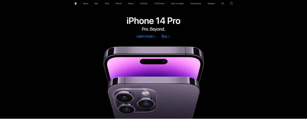
One thing you constantly hear in the world of web design is user experience (if you want to sound cool, the hip kids will often refer to user experience as ‘UX’). There are many ways you can describe a user experience, in a general way and a web-specific way. People conceptualize user experience is nothing more than how we use things, how we perceive things and how we remember things. We can also look at user experience as something that is meaningful and relevant to users.
The holy grail for all web designers is a perfect layout for a website that offers each and every user a homogenous, harmonious and memorable experience when visiting the website they designed. Like many professionals, web designers have some tools in their toolbox that they rely on to craft a good website. For many web design companies, two of the most common and primary layouts are boxed designs and stretched layouts.

Both options have their advantages and disadvantages in terms of converting users and also some effects on SEO. Choosing a boxed or full design is a crucial step in building a web page because it dictates how you arrange the other elements. Stretched layouts are also known as full-width, fluid and liquid, and they are generally harder to build especially if the person who builds them is inexperienced. In this article, we will explore the pros and cons of each of these two design types so that you can learn more about each and think about which would work best for your website.
The Why, What and How: The Designer’s Mandate
Before we dive deeper into boxed designs and stretched layouts, we need to look into the thought process of a web designer and the considerations behind design choices. When a designer starts building a website, they need to think a lot about the why what and how of the website they will build in order to craft the ideal experience for users. The image below gives a good summary of how a designer answers the why, what and how of a website.
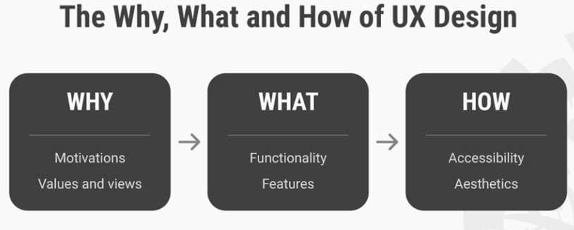
Image via Interaction Design Foundation
As you can see from the image, the ‘Why’ considers a user’s motivation for wanting a website and their views on using that website. The ‘What’ thinks about what people will do with a website. And finally, the ‘How’ looks to package the website in an accessible and aesthetically pleasing fashion. When a designer starts to think about which layout they will design a website with (boxed design or stretched layout), they will have to answer the question: which layout seamlessly aligns with a brand and its product or service to offer users an experience that answers the why what and how of UX design. So, without further ado, let’s look at boxed designs and stretched layouts.
BOXED DESIGN
Also known as fixed layouts, boxed designs consist of setting clearly defined boundaries for the main body of the page. This layout has a fixed width that compartmentalizes all of the content. Boxed designs are notable for padding around the main elements of a web page. Also, regardless of screen resolution, the website will always remain the same size because the container element has a fixed width that is set to not move. To put it simply, the user sees exactly the same thing as the designer who builds it.
Pros
A significant proof of this layout is its consistent appearance. You access the site on your computer, you get used to how it looks and then if you access it on your smartphone, all the page elements are arranged the same way. All that’s different is the need to zoom in to navigate around the website.
These layouts are easier for a designer to make and the display of the content is optimized with less hassle. For example, you can be certain that if you choose a particular width of body text to promote easier reading, this feature will not change from one screen resolution to another.
You also don’t have to stress much about fixed-width content such as videos, images or forms because they will stay unchanged regardless of screen size.
Boxed designs are effective in directing the attention of visitors toward the most important elements of your website, be it banners or call-to-action buttons. They give visitors a certain sense of direction.
Cons
Boxed layouts are not suitable for all browser sizes. Those with a very big screen will have a lot of remaining white space and the actual site elements might be gathered in the middle of the page. On the other hand, people with small screens might need a horizontal scrollbar to go through your content.
STRETCHED LAYOUT
A stretched layout differs from a boxed one because you can use the entire screen to showcase the elements of your page. The content of the website is centred but has a white background throughout the page. Furthermore, the main body is not clearly defined. The container element has percentage widths and can, therefore, adjust according to resolution. In this case, the user does not see what the designer sees unless they both have the same screen resolution.
Pros
By far, the most important advantage of stretched or fluid layouts is their compatibility with different screen resolutions and browser sizes. Less scrolling is usually needed because space is used efficiently, this being particularly important for sites that display lists of products, travel packages, real estate etc.
Fluid designs are perfect for smartphones and tablets, so if the majority of your target audience is mobile-based, it is desirable to have a fluid layout. If the designer is skilled, he might manage to eliminate the need for horizontal scrolling on smaller screens.
Cons
The main issue with fluid layouts is the lack of control that the designer has over what the user sees. He has to foresee potential layout problems that might appear at specific resolutions. Therefore, stretched layouts are more difficult to make and require more experience.
The designer might also have to set different widths for images, videos or other types of fixed-width content to make sure they are displayed properly on various screen sizes. Apart from this, excess white space can be seen on large screens if the website has little content to display.
Should you go for a boxed or stretched website design?
Whether you should choose boxed or stretched website design depends on the nature of your business and what you would like your audience to focus on. Both layouts have their advantages and disadvantages, but their applications will usually vary from industry to industry. Stretched design is usually used when you want the website to focus on the experience and to emphasize luxury. However, regardless of which one you choose, there are many ways to make your website design stand out. Boxed design is used when you want to focus more on the products and/or services that you offer, rather than the brand itself. Here are some examples of when to use stretched and when to go with boxed website design:
Stretched Website Design Examples
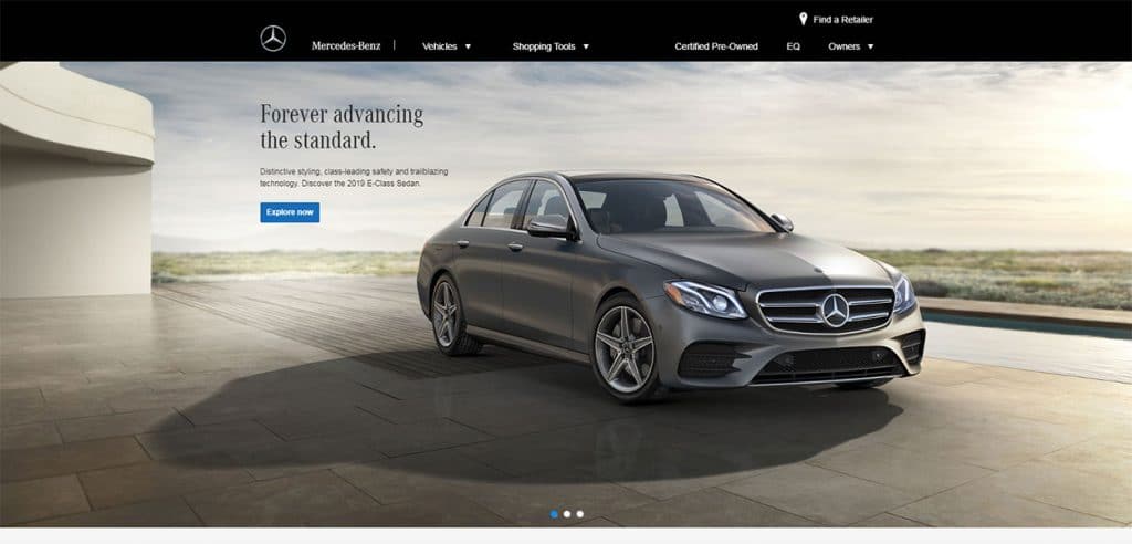
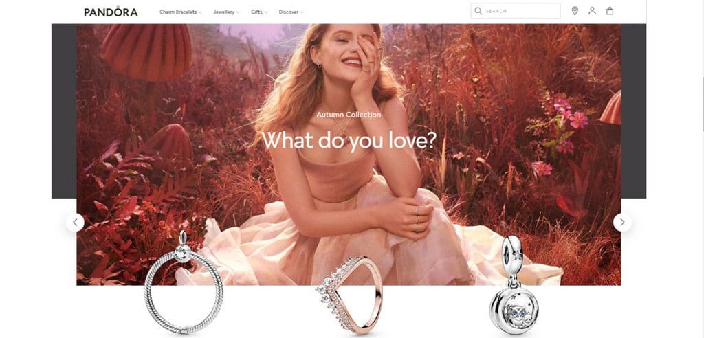
- Luxury car brands frequently use stretched design to emphasize the experience and the beauty of their products:
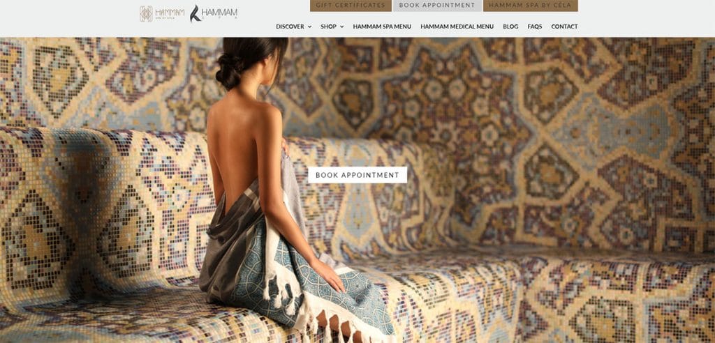
2. Spa centres also want their websites to focus on luxury, which is why you’ll often see their websites featuring beautiful, huge images that stretch across the entire screen:
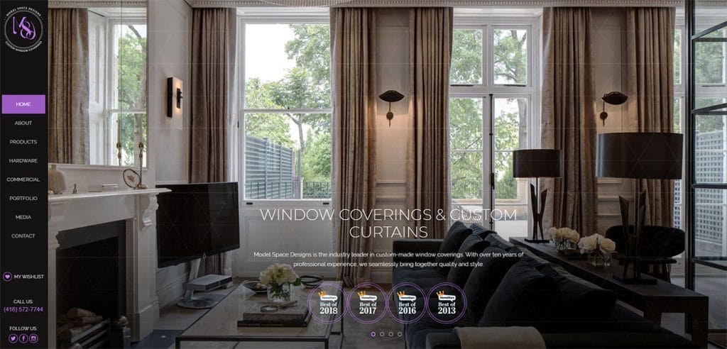
3. The home-decor industry also prefers stretched website design as it offers an opportunity to emphasize the beauty of their interior designs:
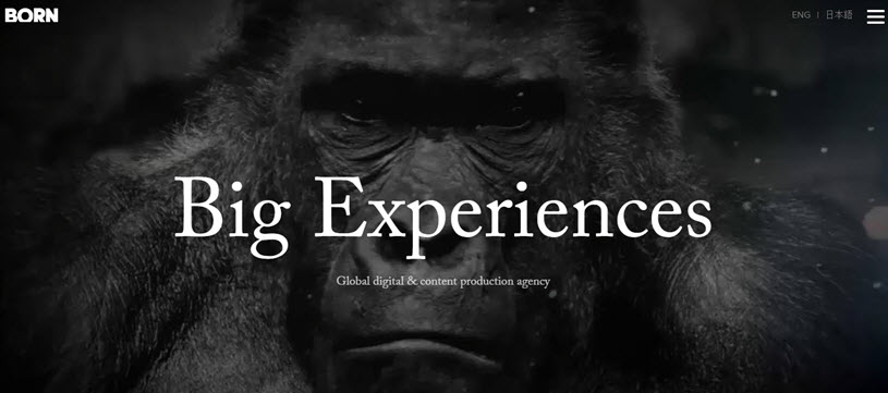
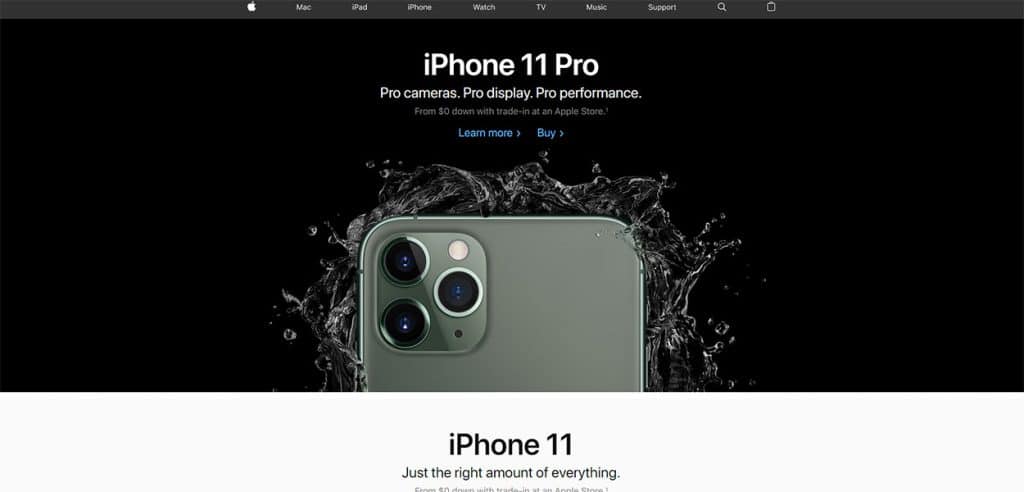
4. Luxury brands prefer stretched designs because it allows them to present their latest products as the focal point of their website and attract users’ attention:
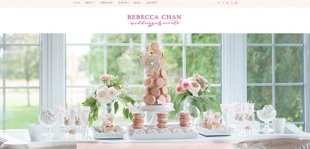
5. Decorators and event planners usually prefer stretched designs to display their projects. This way, users can visualize not only the beautiful decor but also the atmosphere of their special day.
Boxed Website Design Examples
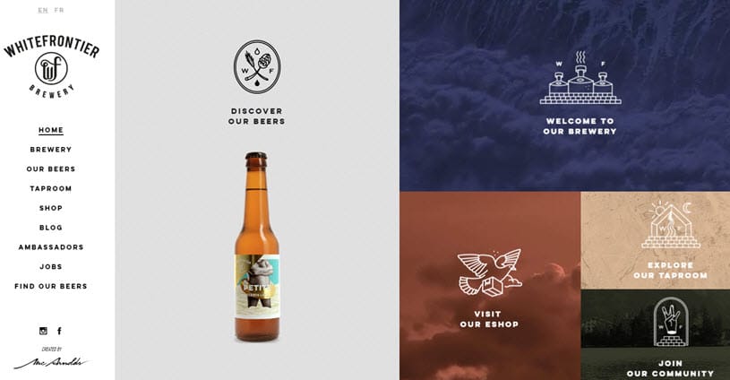
- Boxed website design can also be used to capture the beauty and offer an immersive experience to the user. However, boxed websites are generally more focused on the beauty of the products themelves, instead of the luxurious experience:
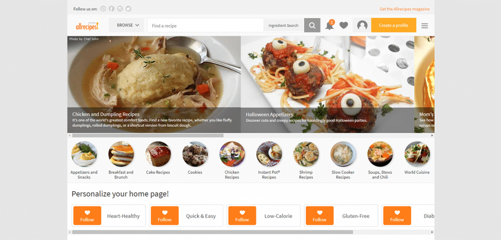
2. Online sellers love boxed design for the exact same reason as the first example – it helps bring the focus to the merchandise, discounts and offers:
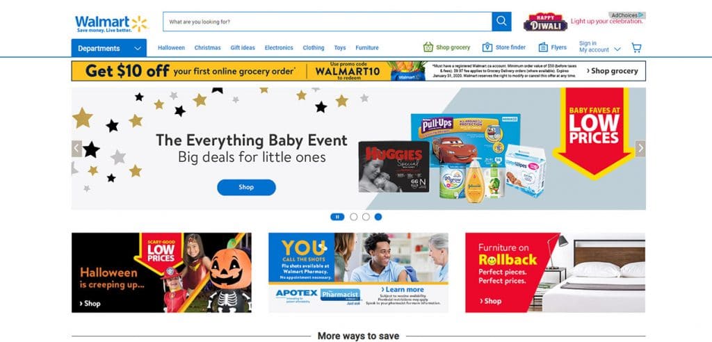
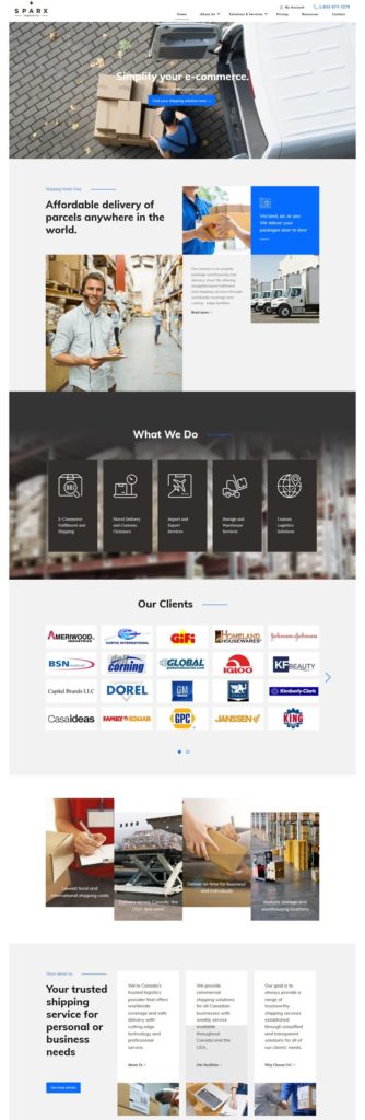
3. Whenever you have a lot of material to show, and you want it all displayed, boxed design is your best friend:
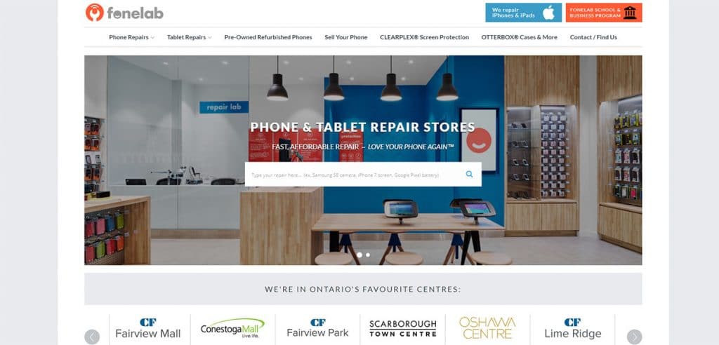
4. Service providers such as mobile repair shops and appliance repair specialists benefit more from boxed website design because it helps them showcase their areas of expertise and establish trust:
There’s a lot to consider when thinking about the blueprint and layout of your website. When it comes to choosing between boxed and stretched web designs, you should think about what works for your brand and showcases your products or services in the best light.
Still wondering which option will be best for your website? Don’t know if you should go with boxed or stretched. Then give the great designers at Gilmedia a call at (647) 478-5858. Our purpose is to help you build a website that looks amazing, works flawlessly and converts customers for you and your business.

Written by